


Ophthalmology and OMPs
RCOph evolves its Logo for modern day digital usage
RCOph evolves its Logo for modern day digital usage
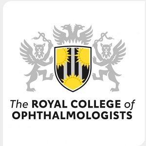
The RCOph says It is good practice for an organisation to review how it is represented by its branding and positioning and this was carried out in 2020.
The development of a new dynamic RCOphth website also precipitated this review to ensure that the RCOphth crest design worked alongside the new website design.
The existing crest, designed in 2014, embodied a move towards a more contemporary reflection of the RCOphth, but seven years on, it needed another evolutionary step to ensure it can work with more modern applications of marketing and communications, particularly in digital media.
The Communications team set out a design brief for the RCOphth brand mark. In response to this, the Executive felt that the crest was important to retain, rather than a more contemporary and revolutionary route.
The result was a more defined crest, with cleaner lines so able to stand out, optimally at reduced sizes, and be used more effectively in digital media as well as in print.